Client: Subversionz Media
Creative Director: Goldie Jones
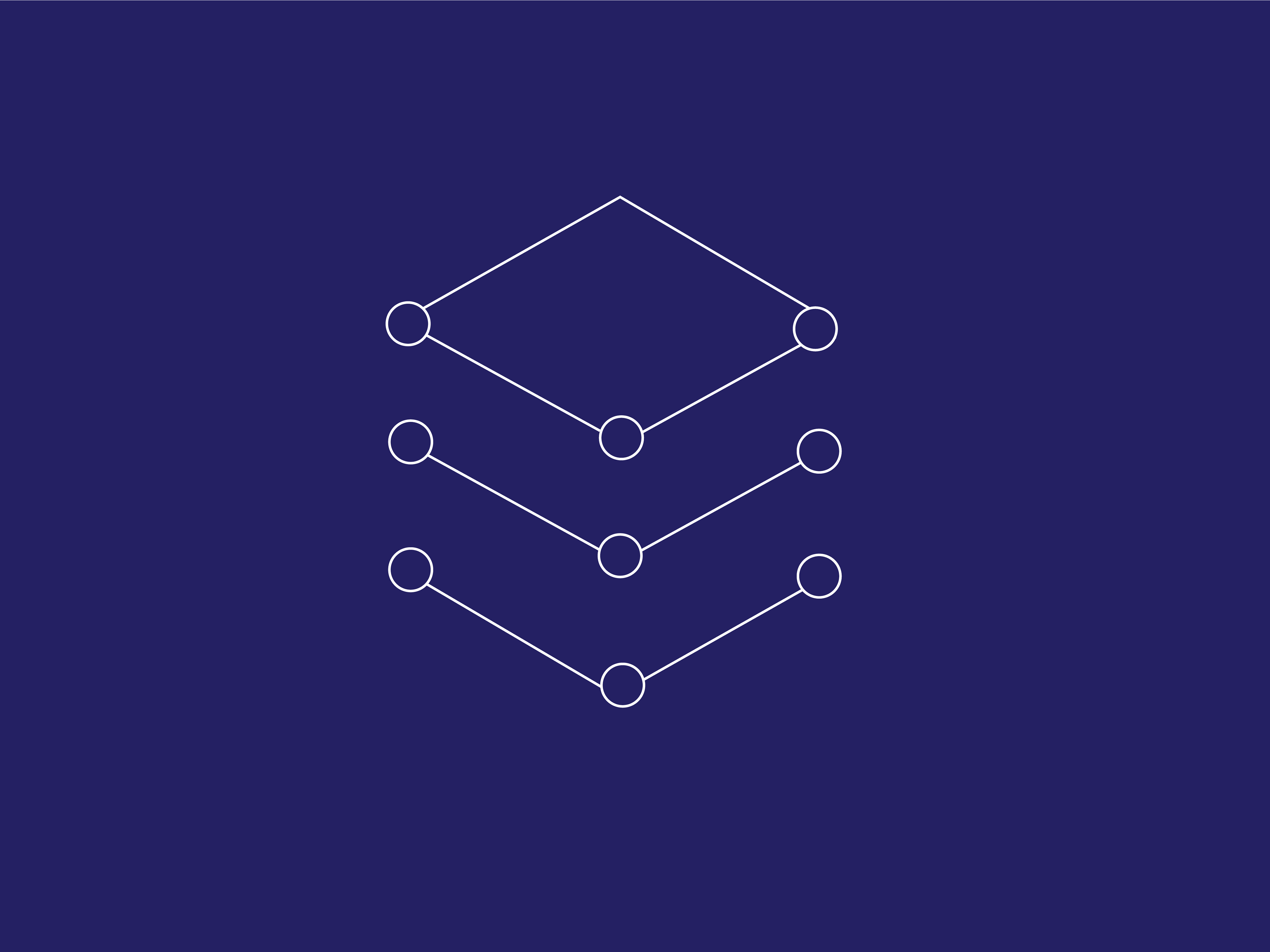
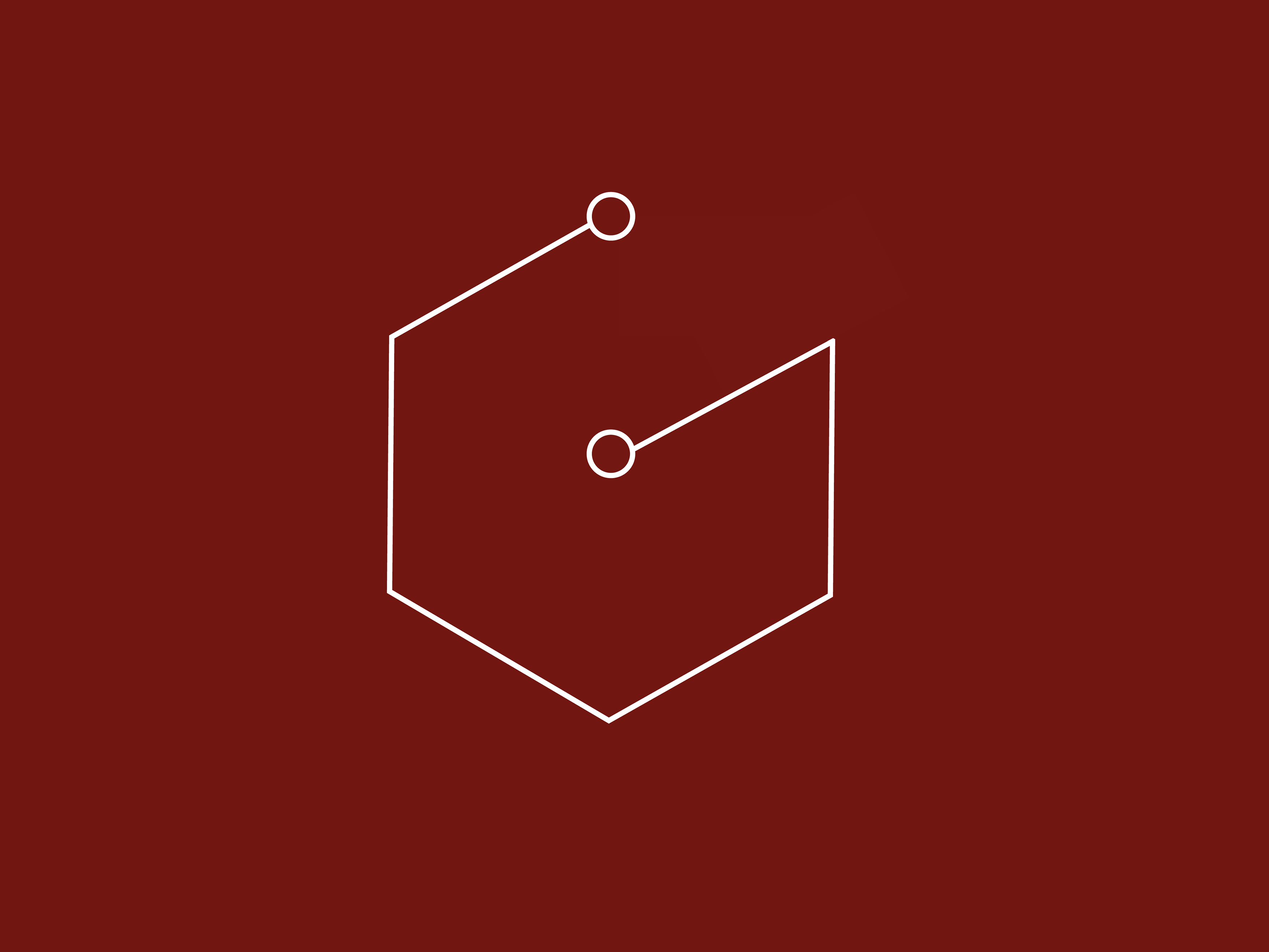
These icons were developed to represent five different components of team work for a corporate event. They were used as the visual core elements while showing ideas like sharing information openly, growth, and team work. The project began with a research deep dive. Next came a frenzy of thumbnails and brainstorming. In the end, it was a honey comb circuitry motif that won out. It was a fun project that promoted abstract thought to create a versatile icon.

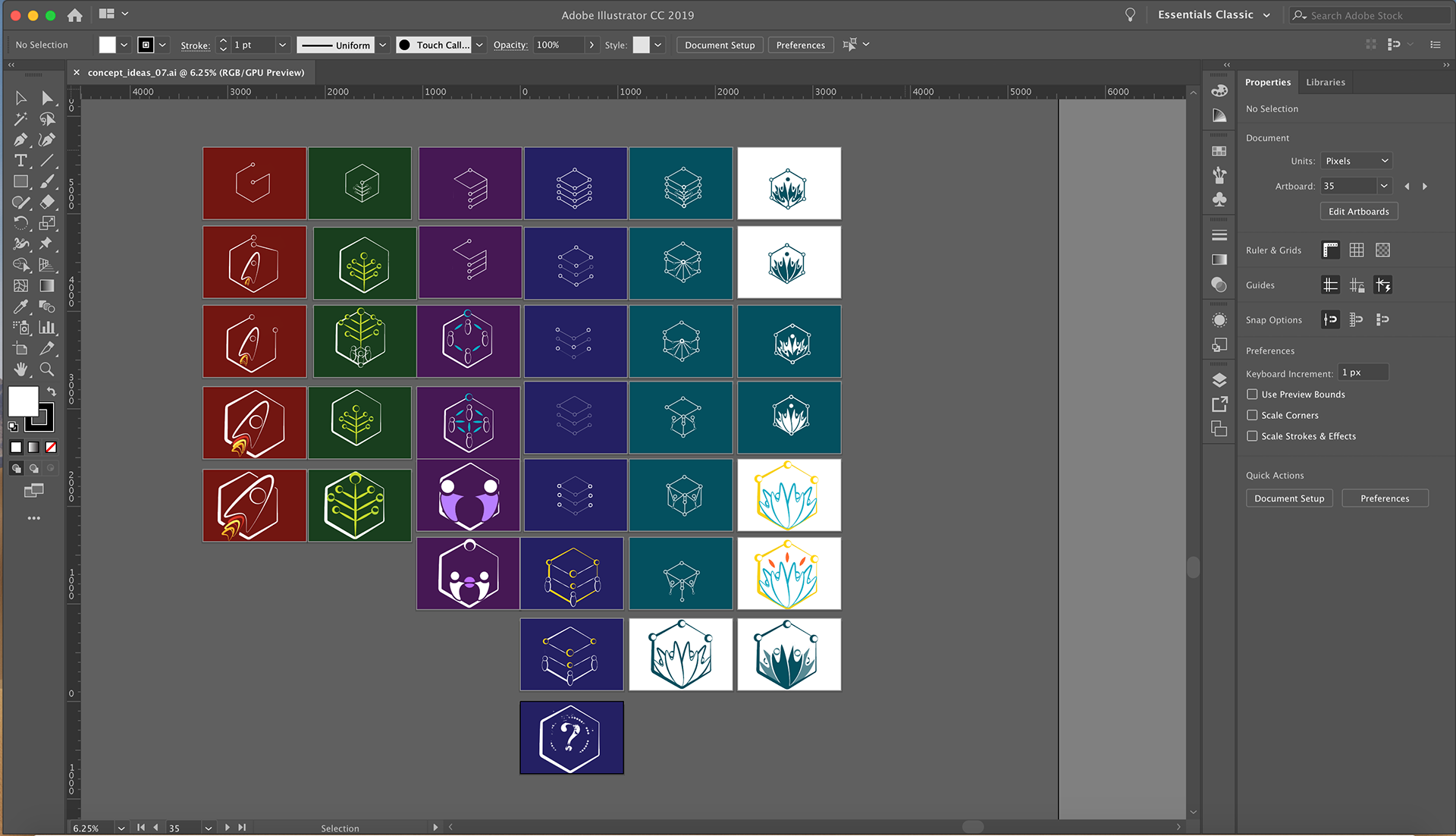
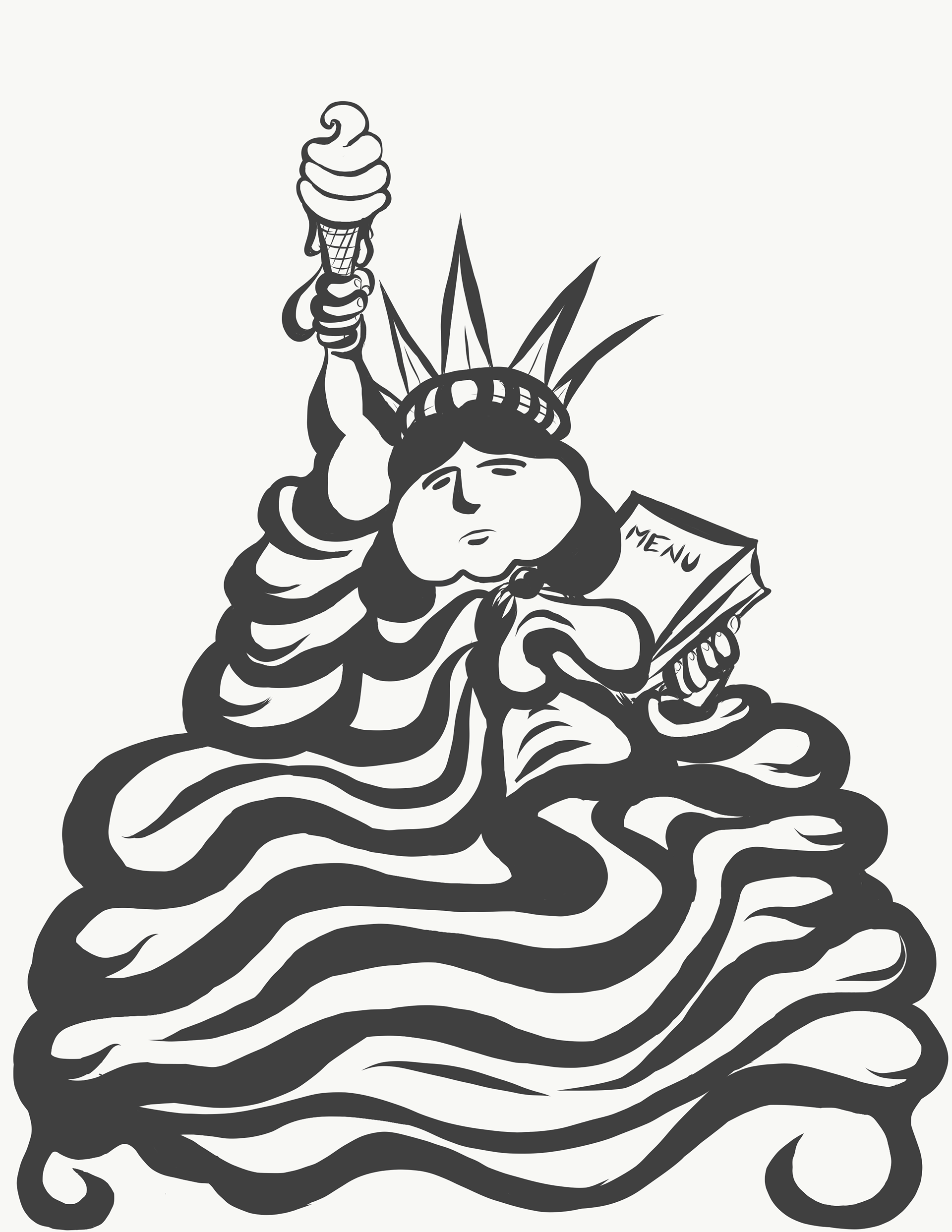
Here we take a look at some tasty preliminary concept sketches and end at the final minty scoop. This illustration was created for a Food Faire to raise awareness about diet and nutrition. I appreciated the opportunity to express a health focused idea through this image, a topic near to my heart.
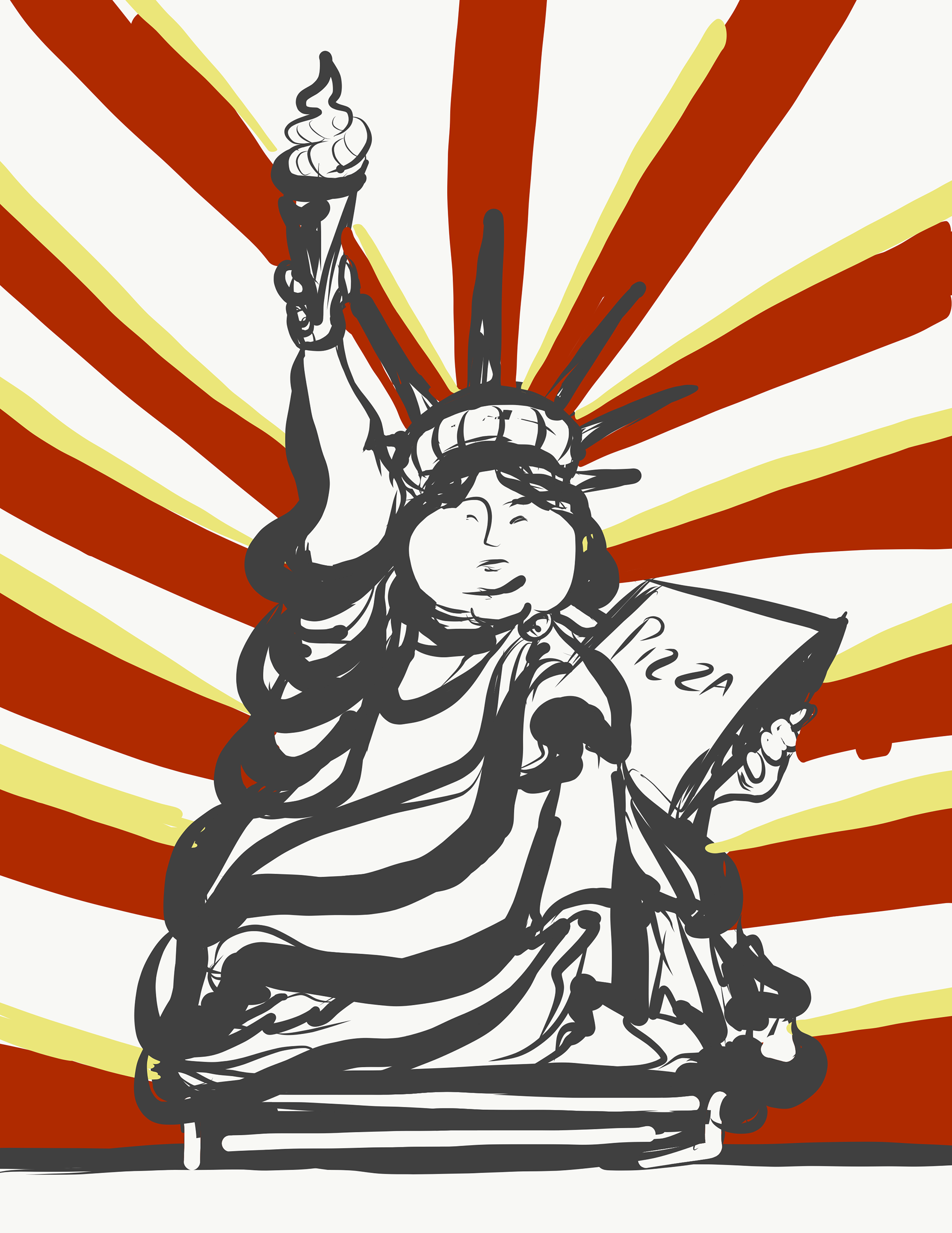


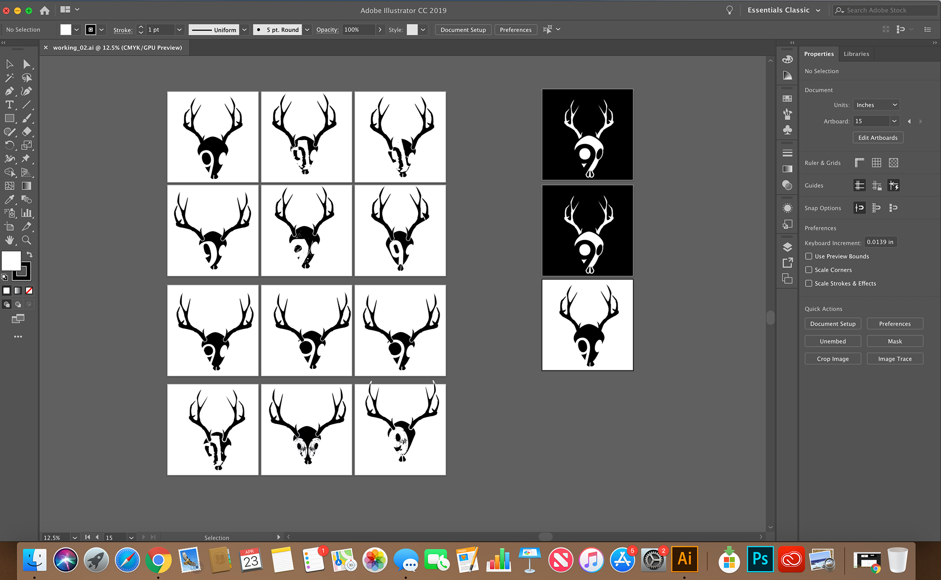
These are some snaps shots of the original branding journey for 9 Creativ Bones. It of course, started with research, thumbnails and worked its way through to the brand elements seen in the bottom image.
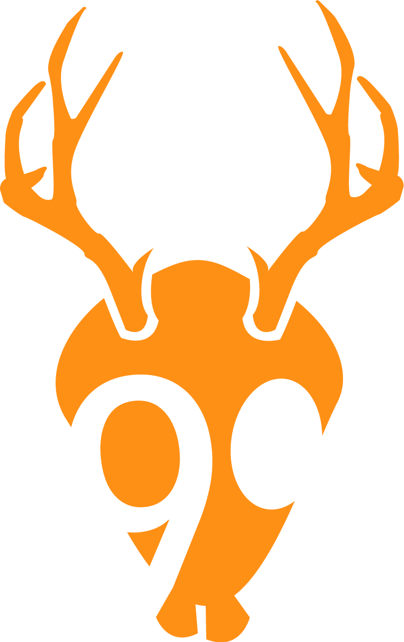
I combined Wyoming heritage, humor, and recovering goth-punk roots to create a logo that could symbolize 9 Creativ Bones. I was inspired by the mystical jackalope and his delightfully goofy teeth. I want people to smile when they notice this logo.

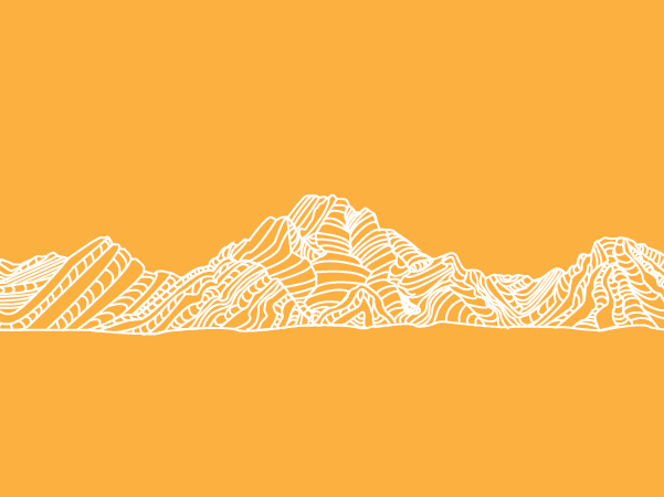
The line-art mountain range is an illustration of the Grand Tetons in Wyoming. I created this graphic, not simply because it's my home range, but also because it speaks to how I value wild remote spaces of our world.

Typographically speaking, Avenir was the winner in the original branding. It was Avenir's clean, simple, straightforward and graceful san serif goodness that won me over.
The color pallet was chosen for similar reasons. It supports a classic, warm, approachable and welcoming vibe for the 9 Creativ Bones brand.

